

The Magic of America: Improving the Electronic Edition
On Friday, I suggested some improvements for Marion Mahony Griffin's "The Magic of America: Electronic Edition" prepared by The Art Institute of Chicago. My comments were a little cryptic, so here are some more details. For more tools and techniques see my Writing for the Web course notes.
Splash Screen
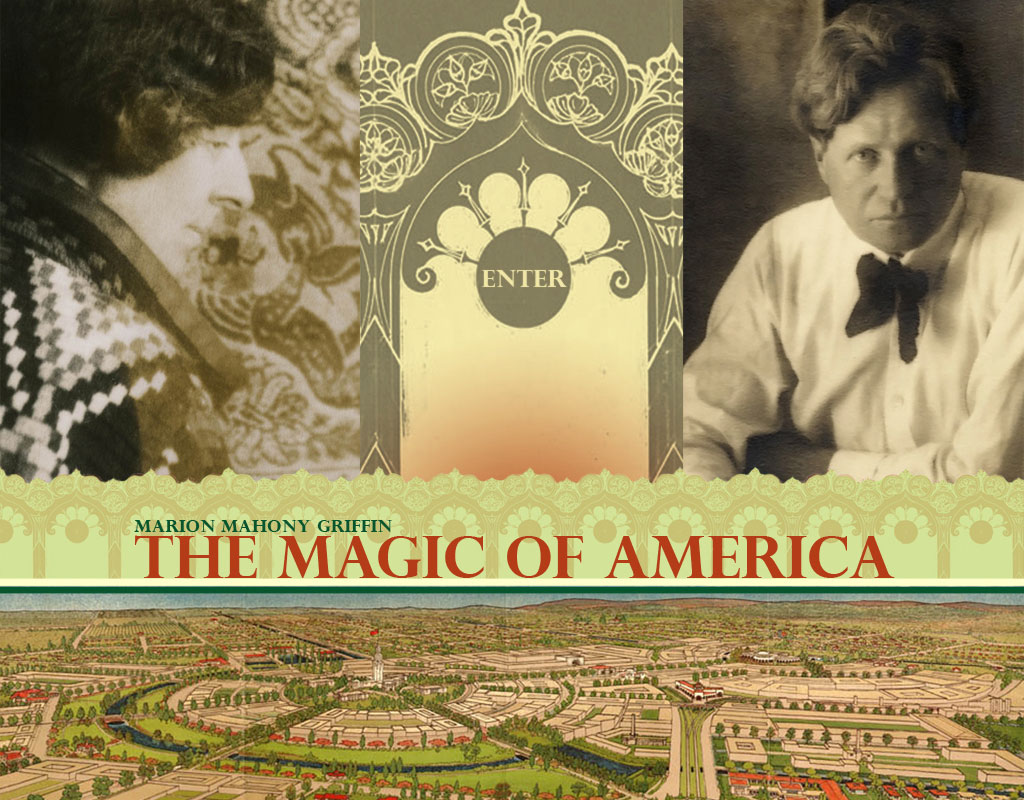
The web site starts with a web page having one large image (1024 x 800 pixels, 229 Kbytes). This is commonly referred to as a splash screen as it is designed to impress the reader. However, this page will take 35 seconds to download on a fast dial-up line (56Kbps), which is too long. The image can be made smaller, as the Art Institute is doing, by reducing the color range and compression. However, a better approach is to disassemble the image into its component parts and have the web browser assemble them on the page.
In this case the splash image is a collage of photographs of Marion and Walter (taken from the frontispiece of the book), and Marion's town plan perspective for the City of Griffith ( 1914 in Section 2 of the book, this is a color version of the one referenced in the Griffin Society Database). On this are superimposed the words "Enter", "Marion Mahony Griffin" and "The Magic of America".
The four images could be placed separately on the page. The text could then be added as ordinary text, not as part of the image. On a slow link the web browser would then display the text quickly and the images would follow along when available. The user would be able to read the text without having to wait for the images.
However, a better option would be to bypass the splash page and make the home page of the site, the one the reader sees first. Smaller versions of the artwork from the splash page could be incorporated to improve the look of the page. The splash page could be retained for use in presentations and publicity, but would not be seen by the average reader.
Divide the Document into Smaller Web Pages
The digital text of the document is provided in four large web pages, corresponding to the four sections of Marion's work. Each of these is about 1.3 Mbytes of HTML (5,381 Mbytes in total). This is far too large for fast downloading. As well as making it slower for the reader, it wastes resources on the web server, as most readers will be just casually browsing and will not scroll down past the first screen-full. I suggest the document be divided into the parts listed in the table of contents, with about 83 web pages, each of about 65 Kbytes, or the equivalent of 9 A4 pages.
It would be possible, but not useful, to go to the extreme and make each of the more than 1,400 pages of the typescript original a separate web page. The O'Reilly Google Hacks book suggests a successful web site should have at least 100 content pages. Such a web site is about the same size as the average book, with each web page the equivalent of three printed pages.
The web pages of Magic of America have the typical 50/50 ratio of text to formatting for a book derived web page. As an example Section 2 has 1,692 Kbytes of HTML, containing 837 Kbytes of plain text, the rest being HTML markup. This section is 447 pages in the original manuscript, the digital text is the equivalent of 204 A4 pages (about the same size as if it was typeset for printing). So if this was divided into 3 printed pages per web page, the result would be 68 web pages. While cumbersome to produce manually, this would be be feasible, but the text does not divide into logical 3 page components.
The table of contents for Section 2 has 26 parts. If each of these were a web pages, they would be on average 9 printed pages per web page, with a logical topic for each. This would seem a reasonable compromise.
It should be noted that the way the document is divided into web pages for delivery to the reader need not imply that it is stored this was on the web server. The electronic original can be kept as larger, or smaller, files, which are assembled by the web server as required.
Virtually Typeset The Magic of America
Both the facsimile typescript and the digital text provided by The Art Institute of Chicago are valuable scholarly resources for research. However, neither is easy to read as a work of literature and do not do justice to the author, or her topic. Web formatting techniques could be applied to the digital text could give it more of the look of a book, without altering the underlying source material. Scholars could switch off the added formatting to see the original.
The manuscript was produced on a manual typewriter, with hand written annotations and graphics pasted in. All this is useful information for the scholar, but difficult to read. The digital text is presented in one size font, left justified, with white space between paragraphs. There are numerous bracketed notes indicating where the original typescript page breaks were. The images ages are inserted as thumbnails, left justified with no text flowing around them.
It would be possible to use Cascading Style Sheets (CSS) to modify the look of the page to make it more like a typeset book. This could be done while retaining all of the information needed by the scholar. By default a book-like version of the digital text could be displayed for the general reader, with options for the scholar to see the extra notes.
A simple compromise would be to:
In this way compromises between showing the historically accurate typescript original and a readable corrected work can be avoided: both can be provided, in the one document, for the relevant readers.
Tags for Marion's Blog
In many ways the typescript original of The Magic of America a series of largely unrelated items from different sources pasted together. Turing this into a conventional book will have lost some of the flavor of the original. The work is in some ways is more suited to a web log (blog), where the separate components have their own existence and can be read and assembled in different ways, depending on the interests of the reader. This could be done by tagging the components of the original work with metadata. The tags would be useful to scholars researching the work, to ordinary readers and to artists interpreting it.
One way the work could be accessed is as a multimedia interactive work. Parts of the work could be selected based on the tags and presented, either online directly for one reader, or as part of a live performance. The components could be selected by the reader, or preselected by a narrator. The narration could be by a person or persons on a stage with parts of the work display on a large screen or on a desktop screen. SMIL and other web technologies could be used to transform the original work for multimedia display.
A fitting location for a live performance would be the Capitol Theatre, Melbourne, designed by Walter Burley Griffin and now a web equipped university lecture hall, or the New Theatre, Sydney, which is fitted with seats removed from the Capitol Theatre in Melbourne, 25 years ago.
This might allow the underlying poetry of Marion Mahony Griffin's work to escape from the limited linear format she was confined to. One way to aid this would be for the The Art Institute of Chicago to place a Creative Commons license on the work, to allow reuse.
Splash Screen
The web site starts with a web page having one large image (1024 x 800 pixels, 229 Kbytes). This is commonly referred to as a splash screen as it is designed to impress the reader. However, this page will take 35 seconds to download on a fast dial-up line (56Kbps), which is too long. The image can be made smaller, as the Art Institute is doing, by reducing the color range and compression. However, a better approach is to disassemble the image into its component parts and have the web browser assemble them on the page.
In this case the splash image is a collage of photographs of Marion and Walter (taken from the frontispiece of the book), and Marion's town plan perspective for the City of Griffith ( 1914 in Section 2 of the book, this is a color version of the one referenced in the Griffin Society Database). On this are superimposed the words "Enter", "Marion Mahony Griffin" and "The Magic of America".
The four images could be placed separately on the page. The text could then be added as ordinary text, not as part of the image. On a slow link the web browser would then display the text quickly and the images would follow along when available. The user would be able to read the text without having to wait for the images.
However, a better option would be to bypass the splash page and make the home page of the site, the one the reader sees first. Smaller versions of the artwork from the splash page could be incorporated to improve the look of the page. The splash page could be retained for use in presentations and publicity, but would not be seen by the average reader.
Divide the Document into Smaller Web Pages
The digital text of the document is provided in four large web pages, corresponding to the four sections of Marion's work. Each of these is about 1.3 Mbytes of HTML (5,381 Mbytes in total). This is far too large for fast downloading. As well as making it slower for the reader, it wastes resources on the web server, as most readers will be just casually browsing and will not scroll down past the first screen-full. I suggest the document be divided into the parts listed in the table of contents, with about 83 web pages, each of about 65 Kbytes, or the equivalent of 9 A4 pages.
It would be possible, but not useful, to go to the extreme and make each of the more than 1,400 pages of the typescript original a separate web page. The O'Reilly Google Hacks book suggests a successful web site should have at least 100 content pages. Such a web site is about the same size as the average book, with each web page the equivalent of three printed pages.
The web pages of Magic of America have the typical 50/50 ratio of text to formatting for a book derived web page. As an example Section 2 has 1,692 Kbytes of HTML, containing 837 Kbytes of plain text, the rest being HTML markup. This section is 447 pages in the original manuscript, the digital text is the equivalent of 204 A4 pages (about the same size as if it was typeset for printing). So if this was divided into 3 printed pages per web page, the result would be 68 web pages. While cumbersome to produce manually, this would be be feasible, but the text does not divide into logical 3 page components.
The table of contents for Section 2 has 26 parts. If each of these were a web pages, they would be on average 9 printed pages per web page, with a logical topic for each. This would seem a reasonable compromise.
It should be noted that the way the document is divided into web pages for delivery to the reader need not imply that it is stored this was on the web server. The electronic original can be kept as larger, or smaller, files, which are assembled by the web server as required.
Virtually Typeset The Magic of America
Both the facsimile typescript and the digital text provided by The Art Institute of Chicago are valuable scholarly resources for research. However, neither is easy to read as a work of literature and do not do justice to the author, or her topic. Web formatting techniques could be applied to the digital text could give it more of the look of a book, without altering the underlying source material. Scholars could switch off the added formatting to see the original.
The manuscript was produced on a manual typewriter, with hand written annotations and graphics pasted in. All this is useful information for the scholar, but difficult to read. The digital text is presented in one size font, left justified, with white space between paragraphs. There are numerous bracketed notes indicating where the original typescript page breaks were. The images ages are inserted as thumbnails, left justified with no text flowing around them.
It would be possible to use Cascading Style Sheets (CSS) to modify the look of the page to make it more like a typeset book. This could be done while retaining all of the information needed by the scholar. By default a book-like version of the digital text could be displayed for the general reader, with options for the scholar to see the extra notes.
A simple compromise would be to:
- Use the text descriptions in the menu, in place of numbers, to make it a usable table of contents. Thus " Number 2" would be replaced with "2. Melson River Bottom Flower Garden".
- Retain the left justified text and paragraph white space. But use bold, italics, and different text sizes in place of the uppercase and underlining used in the typescript.
- Enlarge the images to half the screen width (about five times the current size or about VGA 640 x 480 pixels). Center the images on the page, with the caption underneath. Use a different type style for the captions.
- Reduce the notes to a symbol which can be clicked on, or moused over, to obtain the details,
- Make the links to the facsimile pages an in-line symbol, so they do not beak up the pages as much.
In this way compromises between showing the historically accurate typescript original and a readable corrected work can be avoided: both can be provided, in the one document, for the relevant readers.
Tags for Marion's Blog
In many ways the typescript original of The Magic of America a series of largely unrelated items from different sources pasted together. Turing this into a conventional book will have lost some of the flavor of the original. The work is in some ways is more suited to a web log (blog), where the separate components have their own existence and can be read and assembled in different ways, depending on the interests of the reader. This could be done by tagging the components of the original work with metadata. The tags would be useful to scholars researching the work, to ordinary readers and to artists interpreting it.
One way the work could be accessed is as a multimedia interactive work. Parts of the work could be selected based on the tags and presented, either online directly for one reader, or as part of a live performance. The components could be selected by the reader, or preselected by a narrator. The narration could be by a person or persons on a stage with parts of the work display on a large screen or on a desktop screen. SMIL and other web technologies could be used to transform the original work for multimedia display.
A fitting location for a live performance would be the Capitol Theatre, Melbourne, designed by Walter Burley Griffin and now a web equipped university lecture hall, or the New Theatre, Sydney, which is fitted with seats removed from the Capitol Theatre in Melbourne, 25 years ago.
This might allow the underlying poetry of Marion Mahony Griffin's work to escape from the limited linear format she was confined to. One way to aid this would be for the The Art Institute of Chicago to place a Creative Commons license on the work, to allow reuse.
Labels: Architecture, Griffin
0 Comments:
Post a Comment
Links to this post:
Create a Link or bookmark with Digg, del.icio.us, Newsvine or News Feed
<< Home