A set of tools and techniques have been developed to make the content of web pages more accessible. The best known of these are the W3C Web Content Accessibility Guidelines, with automated testing in the TAW Accessibility Tool. The use of such techniques is required by Australian anti-discrimination legislation, including by schools, TAFEs and universities in delivering education online. What is not well understood is that while these techniques are mandated for access by people with a disability, they can also be used to help with slow Internet connections, for limited devices such as mobile phones and for people with limited literacy.
There are additional guidelines and tools to help develop content for mobile devices, such as the W3C Mobile Web Best Practices and . Previously this required development of a second version of the content, specifically for mobile devices. However, as smart phones become more affordable, with larger screens and better software, it is possible to author the same content for education and service delivery to both desktop and mobile devices.
Providing accessible content and to mobile devices requires the web designer and the content author to make difficult decisions. Compromises must be made over what can be delivered and in what form. This can help make better content and better learning, by eliminating material which is entertaining, but not educational.
Some simple tools and techniques can be used to allow any web site to be usable on a mobile phone and improve its rating with web search engines. These techniques can also help make your web site easier to understand for people using an ordinary web browser and particularly for use by older people.
Tom Worthington

- Web Master, Department of Defence, (1994 -1996)
- Adjunct Lecturer, Australian National University
- Course Designer, Australian Computer Society
Tom Worthington is an IT consultant and an Adjunct Senior Lecturer at the Australian National University, where he teaches the design of mobile web sites, e-commerce and green ICT. In 1999 he was elected a Fellow of the Australian Computer Society for his contribution to the development of public Internet policy.
Tom was an expert witness in the Human Rights Commission for the Sydney Olympics web case and was invited to Beijing to advise on the design of the web site for the 2008 Olympics. He is a past president, Fellow and Honorary Life Member of the Australian Computer Society, a voting member of the Association for Computing Machinery and a member of the Institute of Electrical and Electronics Engineers.
Plato's iPad

- Writing Tablets of ancient Greece look remarkably like tablet computers
- IT has advanced in 2000 years
- User's physical and mental abilities have not.
Modern tablet computers are about the same physical size and shape as ancient wax tablets used for writing. While information technology has advanced in the last two thousand years, the physical and mental abilities of the user have not changed greatly. In designing content to be found on the web and displayed on mobile devices, the limitations of the human user need to be taken into account. In this way it is possible to optimise web content for search and display, while the technology of the display devices changes.
Gadget Taxonomy


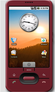
- Pocket size: Apple iPhone, IPod Touch, Google Android Phones
- Handbag size: Amazon Kindle (smaller unit), and Kogan k-Pad
- Satchel size: Amazon Kindle DL, Apple iPad, Netbooks
May have local WiFi Internet access or 3G access
All use some sort of web HTML format
People will have multiple gadgets
One way to categorise the large number of portable gadgets which can be used is how easy they are to carry. The smallest general purpose device has a screen the size of a credit card (Apple iPhone, IPod Touch, Google Android Phones). These screens of these devices are usually touch sensitive.
The next size of device is too big for a pants pocket but might fit in a trench-coat or handbag (small paperback book sized with screens about twice to three time as large as a credit card). Examples are the older smaller Amazon Kindle and smaller Apple iPad clones (5 or 7 inch screen).
The largest size gadgets merge with the smallest laptop computers. These are satchel size netbook computers and tablets: Amazon Kindle DL, Apple iPad, Netbooks. These are screens of at least 10 inches and either a touch screen and/or keyboard. One format which might become popular is a netbook with a touchscreen which can be twisted around to fold over the keyboard, making a table computer.
Devices are likely to have wither local WiFi Internet access or mobile 3G access. WiFi is useful for home use and on a suitably equipped campus. Mobile 3G is useful for access on the bus.
All these devices are likely to use some sort of web HTML format. E-books tend to use some sort of HTML subset. However, it is possible to create web content for all these devices.
People will have multiple gadgets, such as a smart phone and a netbook. It is not clear who will be willing to carry which devices.
Run a business on your phone, or a war

- Technology which was in Australian and US DoD is now in your phone
- Use tools: (W3C Mobile OK)
- Extend the enterprise application to mobile with clear, simple and efficient interfaces.
Exercise KANGAROO 95 took place in an area of over 4 million km square, across the Top End of Australia from July to the end of August 1995 and involved over 17,000 Australian Defence Force troops, and visiting units from the USA, Malaysia, Singapore, Papua New Guinea, the UK and Indonesia.
Reports and photographs were transmitted from the exercise area using stand-alone portable satellite communications terminals, capable of 64kbps.
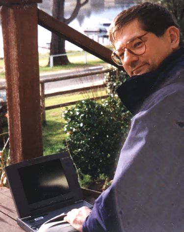
As manager of the Defence home page, I received the reports at Defence headquarters in Canberra and up-loaded, them to a publicly accessible Internet server at the Australian Defence Force Academy.
For the first week of the exercise I was officially on holiday, but maintained the K95 home page remotely using a pocket 2400 pbs modem and lap top PC from Mallacoota, Victoria.
In later exercises, such as Tandem Thrust 97 made more use of the Internet for the operations. However, the level of technology used in these exercises is similar to that now available in a 3G smart phone for about $1,000.
E-mail, the web and instant messaging can be used for business and government from a smart phone with a little forethought. Check your business web pages are mobile compatible. Make sure you put the important business information in a simple, clear, easy to read format. Don't use software and technology you don't really need.
The processing power and network bandwidth of the laptop and desktop computers used for exercise KANGAROO 95 in 1995 is comparable with what is available from 3G smart phones in 2009. However, the use of these devices is being held up by poor web design.
Web pages design in 1995 were text rich, with small images and limited layouts. These designs are compatible with today's smart phones. Later more complex web page designs lost this compatibility, due to their complex designs and increased file sizes.
Also web based services need to be designed as services, not as marketing brochures. CSS features supported in modern web browsers allow for web 2.0 features, but organisations need to accept that their staff and their clients will want to be involved in decision making. Effort therefore need to be put into clear, detailed, information rich web sites.
Thinking about interaction with via a mobile device can help you think about how and what to communicate. The limitations in screen size and keyboard access force you to focus on the most important information first.
Some impediments to the use of the technology can be easily removed. As an example, in 2008 the Department of Finance and Deregulation issued a report on "Consulting with Government – online". This was a well reasoned exploration of the issues. However, the report was only issued as large, hard to read online PDF and RTF files.
The Online Consultation Guidelines from the Australian Government Information Management Office (AGIMO) are reasonably accessible and mobile friendly. The home page achieves a 80/100 score on the W3C mobileOK Checker. However, discussion of the document is still hampered by a Commonwealth Copyright Notice.
The Commonwealth Copyright notice used for web pages is essentially unchanged from the Department of Defence web copyright notice developed in 1995. The Australian Government should adopt the Australian Creative Commons Licence, or similar, to allow the free discussion of issues. Similarly, companies should check the licences they impose on information distributed. If you want your product details out there being discussed, don't make it hard.
Flexible Formatting for e-Learning

- Content created with Moodle OSS LMS
- Accessible by screen, print and mobiles:
- web
- Amazon Kindle e-Book
- Same software used by Defence for training.
A web based Learning Management System, provides a useful example of flexible formatting of online content. Systems such as Moodle, are designed to produce accessible web pages. This also allowed the notes to be readable on a smart phone, such as an Apple iPhone. The content can also be converted to e-Book formats for electronic and traditional paper publication.
Moodle has a special function to open up selected content to the Google search engine. The text rich content of Moodle provides for good web search results.
An example of the use of Moodle with web search discover-ability is the Department of Defence. Instead of providing a traditional web site to describe online courses, the Defence Department used the Learning Management System itself to publish the information.
More Information
- Web Technology, Tom Worthington, 2009
- Green Technology Strategies (book), Tom Worthington, 2009: web, Kindle, PDF, Paperback, Hardcover and Large-print
- Tom Worthington
- This document is available at: http://www.tomw.net.au/technology/it/mobile_web_optimisation/
Slides for these notes are also available.
Copyright © 2010 (Version 2, 23 May 2010) Tom Worthington

Optimising Sites for Mobile Devices and Search Engines by Tom Worthington is licensed under a Creative Commons Attribution-Noncommercial-No Derivative Works 2.5 Australia License.
Permissions beyond the scope of this license may be available at http://www.tomw.net.au/technology/admin/.