Sunday, January 17, 2010

E2 Ethos Shelving System

The E2 Ethos Shelf System is on special at Bunnings Hardware. This is a very elegant system using cast aluminium channels attached to the wall, into which slot cast aluminium brackets. Apart from the screw holes to hold the channels to the wall there are no other holes or protrusions in the channels (unlike most modular shelving systems). Each cast aluminium bracket is held by a grub screw tightened with the included Allen key. The shelf brackets have a cast curved support framework. The whole effect is reminiscent of an art deco 1930s train carriage luggage rack.

After purchasing their 1100 mm four shelf pack, it quickly became apparent why these are on special. The system of attaching the shelves to the channels requires close tolerances in the manufacture to allow the brackets to slide up and down for adjustment, but be sufficiently tight so they can be locked in place. Unfortunately half the brackets did not fit in the channel as they were not correctly cast had excessive metal. This required a laborious process of filing down each bracket until it fitted. Also the screw holes for holding the channel to the wall are not sufficiently recessed (a design flaw) so if the screws are not precisely aligned they stop the brackets from sliding past.

After a few hours of filing and of unscrewing and re-screwing, the results look good in a 1930s inner Sydney art deco style kitchen. But it would have been a lot easier to use one of the much less elegant, but more forgiving, modern steel shelving systems.

The E2 Ethos web site seems to suffer similar problems to their shelving system: it looks elegant but is very difficult to use. The home page provides a menu bar and an animation of shelves moving up and down. The only other content on the page is the number "01908 216466". Placing the mouse over "Storage" in the menu displayed a list of items. I couldn't read the items as the text was overlapping. Clicking on the menu items produced no apparent result.

Normally with a poorly designed web page I select "View > Page Style > No Style" so I can see a version of the page without the faulty formatting. In this case that did not work. I could try displaying the source code of the page and try to work out what was going on, but this would be a laborious process, like fining bits off the shelf brackets. As it is the web page provided me with no useful information, apart from confirming the company made shelves which can be adjusted up and down.

Labels: , ,

Tuesday, December 01, 2009

Origami classroom furniture

Modular Computer Desks from Academic Computer FurnitureAcademic Computer Furniture Pty Ltd sell a range of modular computer classroom furniture which reminds me of origami. The desks have geometric shapes which look like they have been folded from a sheet paper. But on closer inspection it appears they have been cleverly cut from a single rectangular sheet, to minimise waste material. Behind the physical design is an interesting philosophy of group interaction pedagogy.

Labels: , ,

Thursday, October 29, 2009

E-documents can make government offices smaller

Media reports indicate that the Finance Minister, Lindsay Tanner has said that new federal government offices will be reduced from around 25 square metres per person to 16 square metres. In January I suggested that as most paper is replaced with computer storage in new offices and the computer storage is located off site, the size of offices should be able to be reduced down to 8 m2 per person. The m2 allocation for Australian Government offices therefore look generous.

Improving the efficiency of central government's office propertyThe UK Government report "Improving the efficiency of central government's office property" (28 November 2007) proposed 12 m2 per person. It should be noted that this is not the actual space each office worker gets, but is calculated from the Net Internal Area (the area within a building measured to the internal surface of the perimeter walls at each floor level), not just the floor space of individual offices. For comparison, The Pentagon was designed for 11.6 m2 per person.


Labels: , , ,

Wednesday, May 27, 2009

Saving money and energy in the learning commons

The University of Canberra is remodelling one floor of its library into a Learning Commons. Library users were asked for input so I should put in some comments, about the use of furniture, computers and lighting. Here are some more comments about floor space, air conditioning and lights:
  1. Reduce floor area: A major determinate of cost and environmental impact of a building is size: the bigger the building, the higher the financial and ecological cost. I suggest using a higher density of seating than is usual in learning commons: twice that currently used in the University of Canberra library. This can be done by using compact computers, carefully positioning seating and interspersing desktop and laptop positions. A space allocation of 2 m2 per student could be achieved with careful design. This could halve the cost of facility.
  2. Separate Air Conditioning: As the learning commons will be open when the rest of the library is closed, a separate air conditioning system should be used, which just conditions that floor. This will save having to heat or cool the whole building, as is done at present. If there are several enclosed rooms, these can be air conditioned separately, so unused rooms are not conditioned.
  3. Automated lights: Normally libraries leave all lights on when any of the building is open, even when large areas are unused. Lights should shift to a lower power setting when an area is unoccupied and switch back to full power when someone enters. This can be done much more simply with LED lights than with fluorescent lights. It should be noted that lights should not switch off completely in open plan areas for safety reasons. Lights can switch off in closed rooms when they are unoccupied and on again when the door is opened.

Labels: , , , , , , ,

Wednesday, May 20, 2009

Designing a Learning Commons

The University of Canberra is remodelling one floor of its library into a Learning Commons. This is to provide more access to computers and facilities for group work. The library users have been asked for input and plans will be on display in June. As a user who has made a study of such learning commons, I thought I should put in some comments:

Some thoughts on a design
  1. Movable furniture is not necessarily flexible: Many of the designs I have looked at use movable items of furniture, on the assumption this makes the space "flexible". In practice the furniture rarely gets moved, after the initial novelty of being able to move it wares off (apart from when the students get playful and use it for furniture sculpture). Where computers and data access is used having movable furniture become very expensive and creates a large maintenance bill. I suggest instead having fixed, low cost furniture with built in wiring, which and be used in different ways, but without having to be moved. Expensive proprietary cabling systems and modular furniture are not needed: cheap laminate will do. The University of Queensland Ezones have a good arrangement with custom made curved desks with wire baskets under the desks to hold the cabling.
  2. Mix laptop and desktops: One trend has been to provide separate areas for laptops and desktop computers, with the laptops tending to get less space. Instead I suggest mixing the two. An example would be to furnish every second workspace with a desktop computer. This would allow for people with laptops, or for people who don't need a computer. It would also allow space for a group of students to cluster around one screen when working together.
  3. Keep some books and magazines: It is a little depressing to go into a library and not be able to find any books or printed periodicals. I suggest retaining some of these.
  4. Movable walls: While moving furniture is difficult, having movable walls is comparatively easy. The University of Queensland Ezones have a good arrangement with training rooms having sliding glass wall, so they can be opened up to the common area when not in use for a class. The space and computers in these rooms then become available for general use.
  5. Thin Clients: More space and less clutter is possible if very small computer processor boxes are used. There are computers available fitted into the screens, but this limits the range of models available. Most computers provided do not require DVD/CD drives.
  6. Combined digital signage and instruction screens: Large LCD screens are now reasonably priced. The library envisages using these for digital signage to stream news to the students. Some of these screens could do double duty being available for group work and then switching to digital signage when not otherwise needed.
  7. Green ICT: The library needs to look at the energy costs of what is proposed. The Library already uses low power thin client computers for catalog enquires and should look at upgraded devices in place PCs for most of the commons. Also LCD screens with low power features should be looked at (although these tend to be more expensive).
  8. Food: Provision for food should be made.
  9. Business metaphor: One useful metaphor I read somewhere (anyone see the reference?) was to think of the learning commons like a business, with a reception desk, offices and the like. This might be a better metaphor for the students to understand than the learning commons (which is rather a mixed metaphor anyway).
How to improve the consultation process:
  1. More clearly communicate the project to the customers: The library invited comments, but this was done in a printed newsletter with small print taped to a wall in the library. They could have used a larger sign. The electronic version of the newsletter is not in a format accessible to the disabled, making it hard for everyone to find and read (I have untangled the broken sentances and words below). It would also help to have explicit instructions on how to comment.
  2. Provide some examples: I spent a year going around Australia and overseas looking at flexible learning centers and learning commons at universities, schools and the private sector and so have an idea as to what is intended. The average library client will have no idea and so it would help to provide some illustrations of examples of what has been done at other libraries.
The Library has been funded to transform Level B of the Library into a Learning Commons. Features include:
  • After-hours access to computers and printers (when the Library is closed)
  • A range of flexible furniture to facilitate group work
  • More computers
  • More power for laptop users
  • LCD screens for streaming news
The layout and facilities of Level B are being redesigned in response to stu-dent preferences for Library spaces The Law collection will move to that support collaborative learn-Level D with a new group studying and social networking, integrate room nearby. Training Room 1 will with access to information resources and productivity software, assist with research and roving help with technology. Major work will commence in August to improve these Library environments.

From May to July, preliminary works for the Learning Commons space will improve facilities for quiet study on the Library’s Level D “quiet zone”.

The Law collection will move to Level D with a new group study room nearby. Training Room 1 will relocate to Level A greatly reducing noise from people traffic on Level D. Detailed plans will be on display in June in the Library foyer. During May, students and staff can have their ideas influence the Learning Commons final design by completing a form for the Suggestion Box in the Library foyer or by going online to the Library website.

From: Under Construction! The Library Learning Commons, Library News, University of Canberra, Autumn Issue ISSN 1836-862x

Labels: , , , , , ,

Monday, January 26, 2009

Improving the efficiency of office use

Improving the efficiency of central government's office propertyThe UK Government released "Improving the efficiency of central government's office property", 28 November 2007. This found that offices ranged from 13.3 to 21.9 square metres per person and recommended a ‘standard’ of 12 m2 per person. This is calculated from the Net Internal Area (the area within a building measured to the internal surface of the perimeter walls at each floor level), not just the floor space of individual offices. For comparison, The Pentagon was designed for 11.6 m2 per person. Offices are designed with provision for paper storage, and more recently for computer installation. Assuming that most paper is replaced with computer storage and the computer storage is located off site, the size of offices should be able to be reduced by about one third, down to 8 m2 per person. Efficient design of desks should be able to reduce this further in open plan offices.

Labels: ,

Monday, January 12, 2009

Cardboard furniture building blocks

Bloxes building blocks made of interlocking pieces of corrugated cardboardBloxes, a US company is offering building blocks made from folded corrugated cardboard for building furniture. The blocks are about 200 mm cubes, but they are not simple boxes, but intricately folded origami like structures. The folds of cardboard reinforce the structure and proved locking between the blocks. These can then be used to build furniture. Exactly how useful this would be is questionable. You would end up using a lot of cardboard.

Labels: ,

Saturday, January 10, 2009

Designing the Learning Precinct

In "The New Design Partnership" (Teacher Magazine, Australian Council for Educational Research, December 2008) architect HamiltonWilson discusses the design of flexible learning spaces at Queensland universities and schools. He criticises traditional learning spaces which assume that pedagogy was exclusively in a didactic mode (that is teachers talking at students). In reality there is a need to support collaborative work much of the time. He discusses the way learning modes can be switched at the Collaborative Learning and Teaching Centre at University of Queensland by electronic screens and lighting.

The library is moving from an individual pursuit to one with some coursework. The new Balnaves Foundation Multimedia Learning Centre at Bond University is given as an example of this (hopefully the building is more functional than the clumsy name). A large art gallery space was converted into a series of subtly defined study spaces using furniture and technology. A third example given is a new Integrated Learning Centre being built at Brisbane Grammar School.

One point the article doesn't make is about the relative costs of these new learning spaces versus traditional classrooms. The new designs tend to take more floorspace and require more expensive technology. The cost of computers and interactive whiteboards is dropping. Also if the flexible spaces are used to replace classrooms, the costs should be comparable. However, administrators need to keep in mind that unless carefully planned the cost to maintain the Learning Precinct could be much higher than traditional classrooms and libraries. The learning technology and high technology fit out can require frequent maintenance, technology upgrades and be subject to frequent failures, disrupting classes.

ps: This positing was prepared at the Tuggeranong Library. This is both a public library and and part of the Lake Tuggeranong College and is an excellent example of efficient use of learning resources.

Labels: , , , ,

Sunday, December 28, 2008

King Furniture Delta Modular Furniture

Back when specifying the the fit-out for my "Smart Apartment" in 2001 I included a sofa bed from King Furniture. I purchased a Delta model from the King range. This is their lowest cost range and most modular. While not cheap, this has worked well as both a sofa and an occasional guest bed

Searching for Sofa Bed
Recently a friend needed a guest bed for a visit by a guest and we did the rounds of the discount furniture stores looking for a cheap fold up bed for a few hundred dollars. Having found nothing, we happened to go past the King Furniture store in Parramatta Road, Annandale in Sydney.

As usual there was a large sign saying "sale" draped across the front of the building. Having nothing better to do we went in, with little hope of a bargan. We realised that the average sofa in the store cost thousands, not hundreds of dollars. The sales people looked a little insulted when told we wanted a sofa bed by the next day. The delivery time on the carefully custom made sofas is weeks or months. They then reluctantly suggested looking in the remainders warehouse across the road.

The Annandale King Furniture warehouse is an anonymous white industrial looking building which I had assumed was part of the adjacent car tire store. The building is kept locked and we had to wait for the sales person to arrive with the key. They opened the door to reveal hundreds of sofas. These were mostly Delta units in imitation suede fabric (of the type I decided to have in my Smart Apartment in place of leather). The problem was then to find enough modules of a suitable colour. This is made difficult because of the very wide range of colours available and there being two models of almost identical sofa design. Eventually we found two modules, with a back, which would make a chaise longue and convert to a single sofa bed, for less than $1,000.

While much more than the few hundred dollars for the typical folding bed, this makes a much more comfortable bed and also an extremely comfortable chair.

Delta Modular System
The Delta sofa system is designed on a 800 mm square unit which has sockets on each side to hold backs, arms, or tables. Modules can be temporally clipped together or perminatly bolted. One unit makes a ottoman, clip on a backrest and you have a chair, add arms and you have an arm chair. Two modules with one back back at the end and one arm on the side makes a chaise longue, two backs at the back make a sofa. Add a module to the sofa to make a corner lounge. There are also small tables which can be plugged into the sockets.

A typical package consists of two double module units forming a corner lounge and one module to make a matching arm chair. The clever part of the system is that you can change it around later, without the need for an tools. Several acquaintances have bought supposedly modular lounges only to find that the corner of the lounge is at the wrong end, or they would prefer to have two small units, but are unable to change it later as it has all be permanently assembled into one shape in the factory. The Delta arrives in bits and you put it together they way you want and can change it.

Unlike a regular sofa bed, which has the mattress recessed under the seat, with the Delta, the seat is the mattress. The bed option consists of two metal bars with a right angle bend in them. These are used in place of the usual backrest connectors and allow the backrest to be laid flat to form a headrest of the bed. Two modules and a back make a king length single bed. Four modules and two backrests make a double bed. While the sofa bed looks a bit ungainly when assembled, it is extremely comfortable.

Two Delta Systems

The original Delta design from King Furniture, which I purchased, had the sockets to clip arms and backs into as bolt on units, on the outside of the sides of the modules. When ordering a chair, you had to specify how many sockets you wanted and where. Each socket was covered in fabric to match the chair. The result was less flexibility.

After buying my chair, I suggested to King that they instead install the sockets inside the top of the modules. In this way the sockets would be invisible (hidden by the cushion on top of the module) and could be installed standard on all chairs. This was done for the series 2 of the the Delta. The same backs and arms can be used between the two systems, with slightly different connecting rods being used.

Another change was that originally the fabric covered arms for the chairs were semi-permanently bolted to the bases. As a result I ordered no arms and used the rectangular wooden tables instead, as these can be moved (and can easily be used to stand a coffee cup). Later chairs have the same socket system used for the arms, allowing them to be moved.

Selling a Standard Unit
Buying a modular chair is a bewildering experience due to the number of options and combinations of options. This is made more complex with the Delta system, due to the ability to rearrange the modules. The sales staff are trained to take the customer though the options and are perhaps a little too proud of this skill.

When I suggested in 2001 that there should be a standard offering to make the process simpler, the sales staff were a little shocked. I eventually ended up buying one two module unit to form a sofa, with two backs and two side tables. With this I purchased two single module units. With one module at the end of the sofa and one it front, this form a long corner sofa. This can be reformed to make a double bed.

I suggested to the staff this arrangement could be offered as a standard configuration in a limited range of colours. They seemed shocked at the idea their very custom product would be reduced to a standard offering. But since them King have offered a standard corner lounge, consisting of two two module units, three backs and sometimes an extra single chair.

On the recent visit to the store I again suggested a standard offering, with the staff again expressing concern. In this case we needed furniture then and there and ideally something we could take away in a compact hatchback car (a Honda Civic). The 800 mm Delta module is small enough to fit into small car and with some effort a two module unit 1600 x 800 mm fitted into the back of the Civic. But it occurred to me that a small system was possible.

If the furniture maker confined itself to the 800 mm module, the units would fit in a small car, or fit on a standard industrial pallet for bulk delivery. To make the modules smaller, they could be vacuum packed, with the foam padding compressed, making the module half as high (the legs screw on and so can be left off for shipping). The frame of the modules is about 150 mm high, with a cushion 150 mm high on top. When compressed the cushion would be about 20mm high. Six modules would fit on a standard size pallet into the back of a small van, such as a Volkswagen Caddy.

The padded backrests could be similarly compressed. in this way a corner sofa should fit in a small hatchback car. To make the purchase simpler, a limited colour range stocked in the store could be offered. Such units could also be sold over the Internet.

To make the shipped modules even smaller, the zips on the bas of the unit could be extended, to allow the hollow base to be used to hold some of the components. As an example, a back, cushion, the legs and one pillow could fit in the base. But this might not be a good idea for take home sales, as it would make the modules much heavier.

See also:
  1. RAVE - King Furniture
  2. King furniture - anyone bought from there?

Labels: ,

Saturday, November 01, 2008

Eco-Design Handbook

The Eco-Design Handbook by Alastair Fuad-Luke, has photos and brief descriptions of an interesting collection of hundreds of environmentally sensitive products, and the suppliers. Unfortunately it is a little out of date, being published in 2005. Amongst the intersting products were the Westborough Primary School’s Cardboard Building and quikaboard lightweight honeycomb building sheets.
Product Description

The Eco-Design Handbook is the first book to present the best-designed objects for every aspect of the home and office, including the most environmentally sound materials and building products. Some of these pieces have already become classics, others have been uncovered from far-away places or difficult-to-find one-person studios. The book contains three essential components. An introduction puts forward the history and latest thinking in green design strategies. Its core comprises two sections devoted to detailed illustrated descriptions of objects for domestic living and products for the office or work-related activities. The third element is a vast reference source, defining available materials, from organic to specially developed eco-sensitive composites and then providing detailed information on manufacturers, design studios, green organizations, online information, as well as further reading and a glossary of useful terms and concepts. Lastly, a comprehensive index makes it possible for the reader to find any product, designer or manufacturer instantly. This is a complete resource, equally invaluable for the broad consumer market and for design professionals. --This text refers to an out of print or unavailable edition of this title.

Product Details

* Paperback: 352 pages
* Publisher: Thames & Hudson Ltd; 2nd edition (March 2005)
* ISBN-10: 0500285217
* ISBN-13: 978-0500285213

From: Eco-Design Handbook, description in Amazon.com, 2008

Labels: , ,

Sunday, October 19, 2008

Industrial Kitchen Aesthetic

Bulthaup and EOOS, have designed a their B2 kitchen, on a workbench esthetic with a sink which looks like a woodworking bench and kitchen cabintes which look loike tool cabinets.

Labels: ,

Tuesday, October 14, 2008

Modular learning commons desk at ANU Library Menzies

I dropped into the R. G. Menzies Building to pick up a copy of "Running the war in Iraq"from the ANU Library. While there I noticed some new modular computer desks for use by borrowers. These are arranged in clusters of four around a central point. Each desk has three sides: two straight sides at 90 degrees and a curved front. The desks are not symmetrical, with one straight side about two thirds the length of the other. The desks are in mirror image pairs with sights screens between. The desks are about 1.6 m wide. All cables are run to the center of the cluster of desks and down to the floor. The cables are visible under the desk, but are not very noticeable amongst the four black back legs of the desks. Standard Dell PCs and monitors are used and the 90 degree angle results in there being plenty of depth on the desk to accommodate the equipment.

The curved fronts of the desks look good, but are not particularly functional, as the curve is so sharp that one hand tends to be unsupported when using the keyboard. It would be useful if two or three students were working together, but not in the section of the library for silent study. The library could save some space by making the front of the desk straight or concave, rather than convex.

Labels: , ,

Monday, October 06, 2008

Computer desk redesign for the National Library of Australia

Sitting in the reading room of the National Library of Australia, I was using one of the computer workstations to research the design of desks for learning commons. It occurred to me that I was sitting at such a desk, so I looked around to see how it was done and what could be improved.

The NLA appears to use a standard desk for visitors in an attractive dark honey timber. These are about 1800 x 750 mm, providing two 900 x 750 mm workstation spaces. There is a surround about 100 mm high at the sides and back of the desks, which is useful for defining the user's space (the library can get busy and there can be competition for space). The same desk design is used for computer workstations, microfilm readers and for paper based work. There are also taller desks to the same design for computer workstations with high chairs.

The desks have a cable hole in the surface to the left at the back of the work surface. This leads into a cavity about 100 mm deep under the desk formed by two large locked doors. This arrangement keeps the cables out of sight and away from interference. Unfortunately the aesthetics of the desks are compromised by an excess of cables behind the Dell computers, along with a magnetic card reader and a security cable. It is not clear why all this excess cable is bundled up on the desks instead of under the desks in the space designed for it.

About on third of the desktop is taken up by the PC boxes. The fans for these computers are directly in front of the user and so in the quite library environment, the fan sound it very obvious.

The library might consider relocating most of the cable in the cabinet under the desk. A second hole could be drilled on the right, to allow the mouse and card reader cables to be shortened. The magnetic card reader could be fixed to the desk at the hole (the card reader is rarely needed and does not have to be so prominent).

Consideration might be given top placing the PC boxes under the desk, but it may be better to wait until they are due form replacement and use disk less, fan less smaller units. In the interim the NLA might want to schedule cleaning of the dust from the fan filters.

Any new desks could be equipped with a 150 mm curve cut into the front to create more space. The cable hole could be relocated to the center of the back of the desk. The desks could be simplified by replacing the full height cabinet at the back with a smaller shelf.

Some 450 mm cabinets for holding printers and ancillary equipment might be made and placed at either end of a row of two desks, allowing the seating to be alternating on each side of the desk.

The NLA might want to adopt the practice of many libraries in having no high chairs for casual use terminals. Having to stand encourages the users to let someone else have a turn.

Labels: , ,

Friday, September 26, 2008

Designs for the Learning Commons

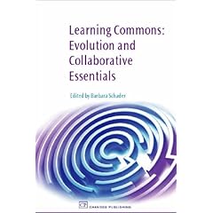
Learning Commons: Evolution and Collaborative Essentials by Barbara SchaderIt is time I took "Learning Commons: Evolution and Collaborative Essentials" (Barbara Schader, 2008) back to the library, so I thought I would blog the best bits:

From information commons to learning commons and learning spaces:
This makes the case for the Library to take on a central role in learning, beyond just handing out books. I would have liked to see some of the practical issues covered. Traditional, at the universities I am familiar with, the Library was one place on the campus which was open for extended hours and staffed. Most teaching spaces were either unlocked and unstaffed (such as lecture theatres) or locked and unstaffed (such as computer labs). Just the fact that libraries have staff makes a useful improvement in service.

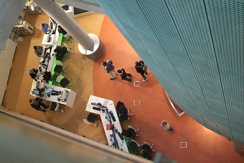
Curvilinear  desks occupied at the Learning Commons of the Unviersity of Calgary LibraryThe Information Commons at the University of Calgary: Susan Beatty: What were most interesting were the photos of desk and classroom designs. What are described as "curvilinear" desks (I have called serpentine). After some searching I found photos at the University of Calgary web site with similar photos to the book, showing the curved desks both unoccupied and occupied. These seem to be older photos with large CRT screens, whereas the book shows the same desks with more modern flat LCD screens. The occupied desks seem to be for individual study, having low zig-zag partitions down the middle of the desk to give the students some privacy. The students are sitting at 90 degrees to the length of the desk.Curvilinear  desks unoccupied at the Learning Commons of the Unviersity of Calgary Library

In contrast the unoccupied photo seems to show a classroom. The same style desks have the students sitting at 45 degrees and no partition down the middle, so they can see the teacher. The rows of desks seem to be much closer together.

Building for learning:
synergy of space, technology and collaboration: Susan Thompson and Gabriela Sontag:Floor plan, Kellogg Library, California State University San Marcos Interior floor plans are shown for the Kellogg Library of the California State University San Marcos. The plan shows a more rectilinear design and more stacks of books than is now common.

The Saltire Centre and the Learning Commons concept: Saltire Centre Glasgow Caledonian University Jan Howden: The photos of the Saltire Centre, appear to be works of art in their own right, unlike the utilitarian photos of other libraries. In finding these I came across "Planning and Designing Technology-Rioch Learning Spaces" (Northumbria University and JISC, 2008), which comes with a remarkable collection of resources:
  1. Case Studies
  2. Flickr Photo Library
  3. Virtual Campus
  4. Further Resources
I was unable to get some of their plug ins to work, but there is also a
printable version.There are also the Designing Spaces for Effective Learning (March 2006) and Spaces for Learning.

Alden Library Learning Commons at Ohio UniversityTransforming library space for student learning: the Learning Commons at Ohio University's Alden Library: Gary A. Hunt: DesignGroup undertook the work for the Alden Library Learning Commons at Ohio University. This shows some very narrow and uncomfortable looking desks wrapped around poles.

Georgia Institute of Technology, West Commons Improving Student Life, learning and support through collaboration, integration and innovation: Crit Stuart: Georgia Institute of Technology, West Commons is shown. This has large desks with a very slight curve along the front.

The Information Commons at the University of Auckland, Hester Mountifield: Floor plans, and papers about the Kate Edger Information Commons are available. An image gallery is also offered, but in contrast to the Saltire Centre, these photos are so artisitc as to be useless for any practical purpose.

Labels: , , , ,

Tuesday, September 23, 2008

Measure of Man and Woman

The Measure of Man and Woman: Human Factors in Design By Alvin R. Tilley, Henry Dreyfuss AssociatesWandering the shelves of the new University of Sydney SciTech Library, I cam across the 1960 edition of designer Henry Dreyfuss' "The Measure of Man". This is a set of charts showing measurements of men, women and children, with how far they can reach and see when standing and sitting. It also gives recommended sizes for desks, consoles and the like.

The updated, politically correct edition is called "The Measure of Man and Woman: Human Factors in Design" by Alvin R . Tilley of Henry Dreyfuss Associates (Wiley, 2001). The original work was developed from measurements taken of people in the US military and had separate sets of charts for men and women (from a time when men and women would be unlikely to be doing the same jobs). The new work combines men and women on the same charts. The full text and images are available via the Amazon online reader.

With the charts you can see what the recommended size for stand up and sit down computer consoles suitable for 99 percent of the male and female adult population, how high a console can be and still be able to see over it, what width to make the console. There are also measurements for children using equipment. This information is of increasing value for libraries, schools and offices as computer based working and learning become more common.

Some of the original information is a little esoteric for the average office, such as how the angle of vision narrows in low light conditions. This might be of value for designing a display used in low light conditions in a museum. The more general information is of value: for example will students be able to comfortably see the whiteboard at the front of the room while seated at a computer in the flexible learning center?

Some problems with the original measurements have been corrected: conversions to mm as well as inches are now provided. But the recommended sizes for desks have been rounded to a convenient number of inches and then just converted to mm. In practice the measures should be rounded for mm. As an example 15 inches is 381 mm, but it would be better rounded to 380 mm. Also the measurements of people used are mostly based on US military. They therefore will be less representative of the average person in the USA and even less typical of the rest of the world.

Sizing computer desks for people

See also some books and DVDs on Industrial design:

Labels: , ,

Wednesday, September 17, 2008

Learning Commons Turning Libraries into blended learning places

Learning Commons: Evolution and Collaborative Essentials by Barbara SchaderOn my way back from the University of Canberra Learning & Teaching Week, I dropped in at their library, which has an excellent selection of books on teaching. Amongst the new books on display was "Learning Commons: Evolution and Collaborative Essentials" by Barbara Schader (Chandos Publishing Oxford Ltd, March 27, 2008). I have been searching for a year for details on how to redesign university teaching spaces for blended and e-learning. This is the best book I have found so far.

The book is edited papers from a conference, so it approaches the problem from several different perspectives and there is some overlap and contradictions. However, it contains very valuable material, including floor plans of actual facilities built.

Since attending a seminar at ANU on MIT iCampus in July 2007 I have been looking at how university classrooms could be redesigned to incorporate computer systems for learning, including classroom room and furniture design. One frustration has not knowing exactly what to call this. Initially I referred to flexible learning centers then blended learning in those centres. While I could find much on the design of courses and e-learning I could find little on the design of classrooms specifically for this. What I did discover from looking at actual learning institutions was that the librarians seemed to be the ones who had the best idea of what to do.

The book is from the point of view of university and other teaching institution librarians, who have already evolved their libraries into "information commons", which provide information not only in book form, but electronically. It suggests taking another step in this evolution and bringing the formal and informal learning into the library with the "Learning Commons". This is something I have seen first hand at libraries across Australia (UQ, UNSW, RMIT, USyd, Concord) and as far a field as Malaysia in the last year (also at Hawker Primary School in Canberra). Also I have looked at classroom design, design documents from Flinder's University, and UK designs. But this is the first time I have seen it set down as a coherent strategy.

The book provides examples of learning commons at universities, mostly in the USA, with the different room layouts designing for different learning activities and how these relate to each other. Typically a library will have facilities ranging from traditional silent individual study, group work areas, discussion tutorial areas, mini-lecture rooms, and cafe style.

After speinding many hours searching for floor plans for "flexible learning" I find that all I had to do was instead look for "floor plans learning commons". I thought perhaps this was a new term, but only 39 of the 746 web pages found with a search are less than a year old. An image search found about 50 floor plans and photos of a delighted eclectic collection of curved desks.

The book covers much more than just how to lay out curved desks, including an overview of software, facilities planning and promotion of a learning commons. It is likely that different readers will find different sections of interest (I found the sections on promotion and planning of least value).

Now that I know I am not the only person obsessed with fitting curved desks with computers on them into a space, I can look at how such spaces might be used. One approach of particular interest is flexible, but fixed, designs. Several of the designs in the book are intended for desks to be rearranged for different learning styles. However, this is difficult to do, particularly where the desks have computers on them. It also assumes that one learning style will be used for one lesson. In computer assisted courses I have run, the learning style changes every twenty minutes or so, and it would not be feasible to move the furniture or change rooms this often.

The hidden agenda for university in consideration of facilities such as learning commons is to reduce costs by eliminating lectures, lecturers and lecture theatres. Advocates of the US "cabaret" style teaching, including the MIT TEAL, suggest that mass lectures can be replaced with a sort of mass tutorial/workshop. A room holding one hundred or more students has a main presenter in the middle (somewhat like a cabaret singer in a nightclub) and several roving tutors (like waiters at the cabaret). This approach also argues that mass machine marked multiple choice tests can be used, supplemented sometimes with students marking each others work. None of this sits comfortably with a research lead institution, like the ANU.

What perhaps will sit comfortably with institutions is a blended approach. This could eliminate large dull lectures, without creating the large cabaret tutorial. One approach would be to have small lectures for about 25 students. These lectures would be recorded and made available to the students, along with the same computer based materials used in the room. Students could choose to attend the live lecture, or view it online. They would be given the same interactive exercise to do regardless of if they came into the room or did it remotely.

Based on my experience of the effect of audio podcasts on lecture attendance, I expect only about 25% of the students would choose to attend any particular lecture in person. So the rooms used would need to hold only 25 students, for a class of 100. Rather than use cabaret as the metaphor, this format would use a "live" TV variety or game show with the students as the participating studio audience. This would provide for a more lively performance, than where a teacher pre-records a lecture sitting alone in a small booth, on in a darkened lecture theatre in front of hundreds of invisible students.

If only 25% of the students attend an average lecture, such a system would deliver similar savings in staffing and space to other computer enhanced teaching formats. Existing tutorials rooms could be equipped for this format, without having to move walls. Standard office buildings could be converted to and from teaching spaces, unlike lecture theatres which require specially engineered buildings. The cost of equipping each room with an interactive white board and a computer for each student are dropping, whereas the cost of buildings and land tend not to.
Summary: This book examines successfully planned and implemented Library Learning Commons at several different academic institutions around the world. These case studies provide a methodology for effective planning, implementation and assessment. Practical information is provided on how to collaborate with campus stakeholders, estimate, budgeting and staffing and determine the equipment, hardware and software needs.

Also provided are memoranda of understanding (MOUs), planning checklists and assessment tools. This book reflects a unifying focus on both the evolution of learning commons to learning spaces and the collaborative aspect of co-creating learning spaces. Key Features: Unique case studies representing very different types of Information Commons, Learning Commons, Faculty Commons and other Learning Spaces International breadth and depth is assured through inclusion of case studies from Canadian, New Zealand, Australian and European institutions in addition to six in the United States

Practical checklists of planning and implantation considerations, as well as memorandum of understanding(MOU)templates, form the appendices Readership: Librarians, administrators, faculty and other educators in both public and private academic institutions will find this book helpful in developing learning spaces in their institutions. They will learn how to adopt and adapt these spaces for their institutions. Graduate library science faculty will also use this book as a text. ...

From Amazon.com's summary of "Learning Commons: Evolution and Collaborative Essentials" by Barbara Schader (Chandos Publishing Oxford Ltd, March 27, 2008).

Contents

  1. Introduction - Barbara Schader
  2. From information commons to learning commons and learning spaces: an evolutionary context. Mary M. Somerville, Assistant Dean, California Polytechnic State University. Describes the evolution of information commons to learning commons to learning spaces with references to key literature and implementations/installations. A subchapter covers Library 2.0.
  3. Beyond facebook: thinking of the learning Commons as a social network. It presents characteristics of the current generation of students and implications for collaborative learning spaces. Jill McKinstry, Director, Odegaard Undergraduate Library, University of Washington, Seattle, Washington, USA
  4. Supporting the learning commons concept in the real world. Jenn Stringer, Associate Director for Educational Technology, Stanford University School of Medicine, Palo Alto, California, USA
  5. Transforming service delivery: Teaching and learning within the information commons. Shahla Bahavar, Information Services Coordinator, Leavey Library University of Southern California, Los Angeles, California, USA
  6. Engineering student success through critical partnerships. Crit Stuart, Associate Director for Public Services, Georgia Tech, Atlanta, Georgia, USA7. Susan Beattie, Head, Information Commons, University of Calgary, Calgary, Canada
  7. Improving student life, learning and support through collaboration, integration and innovation. Hester Mountifield, Assistant University Librarian, Information Commons & Learning Services, The University of Auckland Library, Auckland, New Zealand
  8. Evaluation and assessment
  9. Conclusions and predictions

Appendices

  • planning collaborative spaces in libraries
  • planning checklist (checklist with sections on preliminary planning, project kick-off, project definitions, space planning, personnel, budgets, collaborations, service considerations, marketing, pre-launch analysis, launch, post-launch analysis)
  • templates for Memorandum of Understanding (MOUs) to be used when entering into collaborations with other institutional entities
  • floor plans, diagrams and pictures of current successful learning spaces.

Labels: , , , ,

Wednesday, September 03, 2008

Small desks for blended learning

A curious trend I have noticed in universities and research libraries is to provide larger desks for those with a computer than those without. With a computer the desks seem to be about 1200 x 800 mm per person, without a computer 900 x 700 mm. The computer keyboard, processor and screen takes up space and so it would seem to make sense to provide a larger desk, but even so, the computer desks are much larger. This may just be because they are newer. After looking around it would seem reasonable that if you have just the computer and keyboard on the desk (no processor) box, then a 900 x 600 mm desk is adequate.

If there are two rows of desks pushed back to back, with the seating staggered (that is the people on one side do not directly face those opposite) then it should be possible to reduce the depth of the desk to 450 mm. For privacy and noise reduction, the usual library carrels could be used, but the monitors themselves will form a a partition down the centre of the desk.

See also books on:
  1. Designing Campus Learning Environments
  2. Library design
  3. Classroom design

Labels: , ,

Thursday, July 31, 2008

Computers at the new Unviersity of Sydney SciTech Library

The Unviersity of Sydney SciTech Library opened on Monday. So I went along yesterday to look at their computers for students. The library has an interesting design of modular hexagonal desk for computer users. But laptops are provided for group work in a closed room, which may not be such a good idea.

The Building

The library is on the Darlington Campus, with a pedestrian bridge across the road to the main campus. The SciTech Library combines the technology collections of the university, including architecture, engineering and mathematics.

The library is on Level 1 of the new Jane Foss Russell Building (160 City Road), which was previously the Sydney Central building. The building appears to be not quite finished, with the ground floor fenced off. There are two webcams showing progress: Webcam One and Webcam Two.

The only way I could find into the library, was through the ajcent student services building. While the building has striking colored panels on tdhe street side, it is a bit dull on the other and the library is discretely tucked in underneath.

The library appears to be on one floor, with most services at the front, books in the middle some student desks at the back and some glass walled teaching rooms along one side. It looks a lot smaller than I was expecting and there is the feeling of being in the basement (although the library is on the first floor).

Computers

There are some walk up computers outside the library and some just inside the door. The user interface did not seem to have been quite worked out yet. Clicking on the catalog button first brought up a text terminal window, a warning that all you could get to was the catalog and only then the actual catalog.

The general use computers were HP Compaq units with the LCD screen sitting on top on the desk.

A sunken area has one long sit down computer desk made of hexagonal components. Each hexagon had sides of about 900mm, with two computers per hexagon. The hexagons form a meandering line down the middle of the room. Cabling appears to be run under the desks in a central fixed pedestal and run up through grommets in the desktop. The arrangement seems to work reasonably well, in some places forming niches where several students can work together. The desktops are finished in brightly colored laminate (similar in style to the panels on the outside of the building). While the desktops look modular, they appear to be fixed in place.

The hexagonal desk shape looks good and appears workable, but does not appear to make efficient use of space. The workspace for each student curves away from them. With about half of the 900 mm of space taken up by a keyboard and mouse, there is little space for paperwork. The space beyond the 900 mm bends away from them, making it of little use.

Learning Rooms

The far right wall of the library has several learning rooms. The wall is made of multicolored glass (similar in color and patter to the outside of the building). The glass is slightly textured (possibly be the use of a plastic coating to provide the color), but not sufficiently to provide privacy for classes.

The largest room is equipped with seven clusters, each made up of three tables, with two laptops on each table. The tables are the same size hexagons as outside, but are in plain white laminate and are freestanding with one central leg each. Three tables are pushed into a star pattern, but could be separated or make into fewer large arrangements. The cables from the laptops run down in a gap between the tree desks to floor sockets. The desks appear to have no provision for cabling and the gap needed for the cables spoils the aesthetics, but probably has no practical impact.

The room has non-adjustable white plastic chairs, not the height adjustable ones preferable for computer users.

There were no video projectors, white boards or other teaching equipment evident, but the walls of the room are painted mat white and could be projected onto. There is a movable partition wall one third the way down the room, allowing it to be divided in two.

The room is nearby the bookshelves and does not look very inviting. Also the door to enter was not apparent. The glass walls appear to be fixed and the room locked, so that the computers can't be used by library customers when a class is not booked. In addition the use of laptops would make casual use more difficult,. The laptops are different to the desktop computers in the rest of the library. Also laptops make a very desirable target for thieves making it difficult to provide them in an unsupervised room.

The room appears to be designed for group activities with three people per computer, two groups per table. As with the hexagonal desks outside, the desk layout doesn't appear to make good use of space. It is not clear exactly what the room is intended for and perhaps this has not yet been determined. The room is perhaps too large for many educational uses and perhaps a second movable wall, to divide it into three smaller areas would be useful.

The library might want to consider modifying the room to open it out for use when not needed for classes, using a design similar to the Ezones at University of Queensland.

Labels: , , ,

Thursday, July 24, 2008

Experimental approach to campus planning

The Oregon Experiment book coverOn a visit to the Home Ideas Centre in Sydney I found they have a very good architecture and design bookstore. I asked about books for designing electronic classrooms. Jon Ruwalt, the bookstore manager, was not put off by the unusual request and suggested The Oregon Experiment by Christopher Alexander.

This was the project which lead to Alexander's theory of Pattern Languages, now used for software design as well as architecture. It would be appropriate if this could be used to design both the classroom and the systems for it. However, that is a long way from practical designs. But perhaps someone has done some patters which are applicable.

Labels: , , ,

Sunday, March 09, 2008

Wraparound desks for military radar or learning center

Still from RAAF recruiting video possibly showing the ADGE at 3 Command and Reporting Unit, RAAF Base WilliamstownBrowsing through Asia Pacific Defence Reporter (AIR 5333 February 2008) I came across a photograph of a radar operator sitting at a hexagonal modular desk operating the ADGE at 3 Command and Reporting Unit, RAAF Base Williamstown. What interested me was not so much the hi-tech radar, but the shape of the desk. I couldn't find any more details online, but then Defence Force Recruiting released a RAAF recruitment video featuring an Air Combat Officer apparently filmed in the same room.

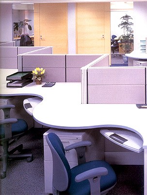
wraparound desksBut I did find a more curved "wraparound" design in "Branded Office Environments: Part 3". Unfortunately there were no details as to what the product illustrated was. If anyone knows, please let me know, as I wanted to see if these would suit a flexible learning center.

Labels: ,

Tuesday, February 26, 2008

Print on demand flat pack furniture

Laser cut tableOne of the revolutions now happening in publishing is print on demand books. You can now do the same thing with furniture: Up load your furniture design to Ponoko, and they will laser cut it from sheets of wood or plastic. You then assemble the parts.

At present Ponoko are only offering to do the cutting; you have to do the sales and distribution. But I expect it will not before such companies offer the additional services the print on demand companies do: they will also sell and distribute the items for you. With this you could design a table and upload the design. When a customer paid for a table, the laser would cut one out and ship it. You would then receive the payment, minus cutting, shipping and handling costs. You would not have to handle any wood, just bank the money.

Of course the catch with this is that the laser cutter is limited to smaller size sheets of thin wood and plastic. The items currently displayed by Ponoko all have a cardboard cutout look to them. Also on demand production is more expensive than mass production.

However, such a process can produce wonderful products in the hands of a skilled designer. The University of Tasmania Architecture students are trained to make designs using a Computer Numerical Control router. One graduate is Peter Walker, who makes wooden surfboards, when not teaching furniture design. prefabricated computer equipped classrooms could be made this way, including ones for remote indegnious communities.

It would be interesting to imagine a store like Ikea, but which make the furniture on demand. The store has no furniture in stock, just a large supply of designs, sheets of wood and a machine to cut it with. You try out the design in the store and then they make you one to take home.

Stewart Brand mentions laser cut plywood in his book The Clock of the Long Now: Time and Responsibility as does Alastair Fuad-Luke in ecoDesign: The Sourcebook.

See also:

Labels: ,

Sunday, February 24, 2008

Wireless electricity for the classroom?

underfloor wireless power transmission sheetPerhaps floors could be fitted to transmit wireless electricity through the legs of furniture for supply to desktop computers and other low power equipment. This could be useful in flexible classrooms where the furniture was movable.

MIT have been working on WiTricity (wireless electricity), to transmit small amounts of power safely over a few metres. But this requires carefully tuned antennas and electronic circuity.

The large round bases of the Jelly bean desks at RMIT Library reminded me of magnets. It occurred to me that if a non ferrous false floor was used, such as raised plastic interlocking tiles, then coils of wire could be placed under them. Matching coils could be placed under the base plates of the furniture. An alternating current in the floor would produce a magnetic field which would penetrate the floor and induce a current in the coil in the base of the desk. This current could be then carried by a wire up the column of the desk and delivered via a plug to a computer on the desktop.

As the two coils would be only about 10 mm apart (through the floor tile and carpet), the transmission would be much more efficient than with MIT's system. A magnet in the base of the table could be used to only switch on the coil, via a reed switch, when the table is present. Such a system may not need any electronics at all and simply operate at the mains frequency and voltage in the floors system. The desk system could be at a safe low voltage, with the coils acting as as step down transformer.

Inductive coupling is used for charging high capacity batteries in electric cars and can carry kilowatts of power. For low power desktop computers only about 150 Watts per computer is needed. The Dell energy calculator estimates that a Dell Optiplex 745, with a 20 inch LCD monitor uses 296 kW hours a year, or about 142 Watts.

There have been proposals for underfloor power transmission before, such as University of Tokyo's wireless power transmission plastic sheet. But like the MIT WiTricity, this uses complex electronic circuits and tries to cover the whole floor. Instead transmitters might be spaced in a grid pattern or only where tables are likely to be located. With floor tiles it would be possible to raise panels and move the transmitters if needed.

Labels: ,

Jelly bean desks at RMIT Library firsthand

RMIT Librar - jelly bean -tablesWith a few hours spare after an ACS professional development broad meeting in Melbourne, I decided to see the RMIT Library's "Jelly Bean" desks first hand. These had been recommended to me, as being a more interesting and practical alternative to rectangular computer desks.

The jelly bean desks are installed in the RMIT Swanston library in the Melbourne CBD. The library is difficult to find, up a series of passageways which look like something from a neglected railway underpass.

First impression of the desks is how small they look, in comparison with those at the
Macquarie University Library's Learning Lounge. But the RMIT desks appear smaller than they are, due to the rounded corners and provide as much useful space as the Macquarie desks. The next impression is how unstable they are. The desks are supported by a single central column, with a small round base, about half the width of the desktop, make from a heavy steel plate. The extra height desks for short term us while standing, appear about to topple over. However, all but one of the desks I saw were clipped together in clusters, using an oval shaped bracket, making them much more secure than they fist appear.

I tried one of the few single desks, which had no PC on it. This seemed stable enough if used for its indented purpose with one person sitting at it. However, in a classroom, if a student sat on one of the wings of the desk it would be likely to tip up. The heavy base plate may well then may then be a hazard. Also the plate prevented a wheeled chair from being moved in close into the desk. Apart from that the desk was comfortable and had enough room for a laptop and papers.

The desks are mostly in clusters of four, around a pole for cables access from the ceiling. Some are in strings of seven, with two rows of desks facing each other. One end of the string of desks is against the wall, to provide power and data access.

There are power/data boxes clipped to each desk. This removes the usual tangle of cables from the desktop, but cables are apparent on closer inspection, hanging down in the spaces between the backs of the desks. The clusters of four have some perforated curved metal privacy screens fitted. The longer strings of desks have no screens.

The clusters of four desks have Dell desktop PCs. These are relatively small desktop units, but even so there is only just enough room for the PC, keyboard and mouse, and some papers on the desk. The stings of seven desks have Apple iMac computers, which have the processors mounted in the LCD case. By eliminating the PC case from the desk, these free up considerable desktop space, but as they have bright white cases, they look larger than the black Dell computers.

The ceiling mounted florescent lighting has been supplemented by additional florescent lights on a bar suspended from the ceiling. The ceiling mounted posts for providing power and data cables to the desks are adjacent to the lighting bar, but not incorporated into it, which gives a visually cluttered look.

The "jelly bean desks" appear to have survived well the punishment they would get from constant student use. There interesting curved shape distracts from the fact they are made from very ordinary looking laminate with a gray plastic edge strip. Some areas which might be improved are the power/cable boxes and inter desk spaces.

The power/cable boxes are rectangular and do not fit in well aesthetically with the rounded desks. Also for computers semi-permanently installed, it is not clear why desktop outlets are needed. In addition as the desks are in clusters, a separate outlet should not be needed for each desk. Low cost multiple outlet power boards could have been fitted out of sight under the desks and shared by several computers. Ethernet cables could have been taken straight to the PCs with no desktop sockets needed. If sockets were needed these could be low cost units under the desk. For desks designed for student laptop use, standard power sockets could be used, which have rounded edges more fitting with the desks aesthetics.

The gaps between desks are mostly hidden in the clusters of four, by the perforated screens. The gaps also provide somewhere to hide the cables, simply hanging down between the desks. But the strings of seven desks have obvious voids between them. Perforated privacy screens are not fitted, nor needed, with the Apple iMac computers as the wide screen LCD monitors are large enough to visually separate the students.

At one point a flat bed scanner has been precariously placed between two desks with some of it suspended over the void. Some way of filling in the holes is needed. One way to visually fill the holes would be to place the desks so the LCD screens obscure them. This would require placing the desks in an alternating pattern, so they do not face each other, as they do now in pairs.

Labels: ,

Tuesday, January 08, 2008

Jelly Bean Tables and boomerang desks

RMIT Librar - jelly bean -tablesI was browsing the University of Canberra library for information about flexible learning centers. This turned out to be very useful as UoC has both interior design and education. Also the university is quiet at present and I got excellent assistance from Beryl Pedvin, Information Literacy Consultant. In passing she mentioned that RMIT Library had "Jelly Bean" tables which could be rearranged.

After some hunting around I found an RMIT web page about the RMIT library refurbishment in 2006 and a PDF brochure with floor plans. The tables are used singly, in small clusters around a central power pole and in long sinuous strings. There are circular plastic clips to hold several desks together and a power/data outlet clipped to each desk. The desks have a single column support. There appear to be perforated metal screens which fit along the front of the desks when used for individual study.

The tables appear to be approximately 1200 x 900 mm, with the shape made up of a 1200 mm semicircle, two 600 mm circles and a 600 mm diameter 200 mm deep slice for the chair to fit in.

There appear to also be smaller oval tables (approximately 900 x 600 mm) using the same central column and leg and oval tables with a bight taken out to fit another oval. The same desktops have also been used with a higher support column for standing desks for short term computer use.

The brochure shows a floor plan with the jelly bean desks arranged around the walls in the "Group study/collaborative, noisy areas" as well as in long chains in the middle of the room, with two desks, front to front. In the "Absolutely silent study area" the desks are arranged similarly around the walls, but those in the center of the room are in clusters of four. In "Training rooms" there are rows of two desks side by side facing the front of the room, angled slightly to the center of the room, an isle and another two desks.

As with all such kidney shaped desks, they do not fit together perfectly when placed front to front, or side by side. The voids left may be useful when the desks are used for individual work, creating space between closely adjacent desks. This also provides a place for cables to run and for columns. However, the holes would be a problem when the desks are used for group work. Also the symmetrical design would not make optimal use of space when packed together.

Petal table by Moen WoodworksWhat might be better is a comma desk with one arm wider and shorter than the other. These would need to be made in left and right hand units, lowering the flexibility of the design. However, the comma shape would take less space. An example of this shape desk is the Petal, from Moen Woodworks.

If the outside of the loner arm of the comma was concave for part of its length, it could be made to fit the outer short side, allowing the desks to be closely packed front to front. If the curvature of the desk is a spiral, or a hyperbola, rather than a part of a circle, the desks could be made smaller, a circle being deeper than required for each read and for smaller modern desktop computers.

Labels: ,

Sunday, November 11, 2007

Hitech Wooden Surfboards

Peter Walker with his wooden surfboard
Peter Walker, was showing his wooden surfboards at the Canberra Biennial today. He is an Associate Professor at Rhode Island School of Design and a Visiting Artist at the Jam Factory in Melbourne.

 wooden surfboard by Peter Walker at the Jam FactoryThe surfboards are made from a plywood framework with holes drilled to make it light. The result looks like the wing of an old biplane. The framework is then covered with thin lightweight wood. The final result looks like a piece of Scandinavian furniture, or part of a traditional Australian surf boat. The board has two bungs to allow the pressure to be equalized on hot days.

The framework of the surfboards reminded me of the work I saw at the UTas Academy of The Arts which architect Helen Norrie gave me a guided tour of in September. It happens Peter has a Bachelor of Fine Art from the Design in Wood program at the Tasmanian School of Art in 1986 and a Master of Fine Art from the Centre for Furniture Design, University of Tasmania.

As I mentioned at the end of my talk to the ACS Tasmanian Branch, wood could be used for hi tech education buildings. As an example aComputer Numerical Control router like that used by the students at the University of Tasmania Architecture school, could be used to shape desks for a flexible learning centre. The desks could have cutouts designed to take Chip PC Inc's PC built into a wall socket. This would remove most of the clutter usual in a computerized classroom. Low voltage LCD displays could be used, eliminating the need for mains power on the desktop, lowering power use and increasing safety.

Labels: , , , ,